
The New Broncos logo meaning goes far beyond a stylistic update — it represents a shift in how Brisbane wants to be interpreted by the public, other clubs and even the city it represents. The timing matters: the Broncos are emerging from a dual-premiership high, the Dolphins are gaining ground in Queensland, and Brisbane is shaping its global profile ahead of the 2032 Olympics.
In many ways, this redesign is less about aesthetics and more about messaging. It tells fans, rivals and potential partners that Brisbane is thinking like a club preparing for a much bigger stage.
How the Rebrand Frames a New Identity & New Broncos Logo Meaning — Editorial Table
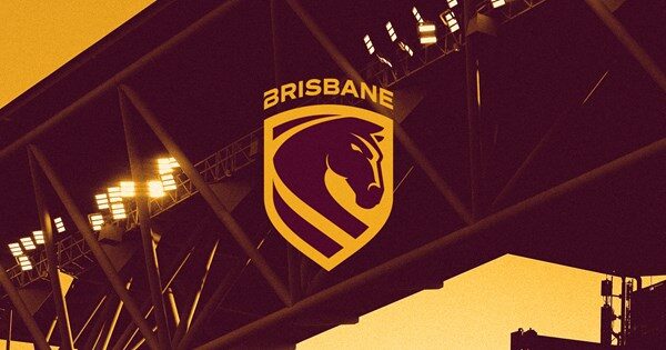
Before judging the logo itself, it’s worth understanding what the Broncos were trying to solve. Their old emblem was iconic, yes — but also cluttered, overly detailed for digital use and increasingly at odds with modern sports branding trends.
The decision to go with a front-facing horse and a city-first wordmark shows the Broncos are chasing relevance in a global sports environment. It’s the same playbook that Juventus, Inter Miami and several AFL clubs have followed: simplify, sharpen, and speak to the world, not just your home base.
New Broncos Logo Meaning — Editorial Table
| Design Decision | What It Suggests About the Club |
|---|---|
| Forward-facing horse | A club projecting power, assertiveness and readiness for global presentation. |
| Shield format | A return to classic sports symbolism — protection, pride and tradition. |
| Brisbane wordmark | A deliberate claim on city identity as competition for Queensland territory grows. |
| River line | A reminder that identity is geographically anchored, even as the brand modernises. |
| Minimalism | A club that wants to appear clean, confident and future-first. |
When viewed this way, the logo becomes less a piece of art and more a calculated strategic move.
New Broncos Logo Meaning in Real Use: Jerseys, Word Choices & the New Slogan
This is where the New Broncos logo meaning becomes clearer — not on a static page, but when seen on jerseys, social media posts, press backdrops and scoreboard graphics. The front-facing horse works better in motion. The shield stands out on a crowded jersey. The straight river line aligns visually with modern design systems used by NRL broadcasters.
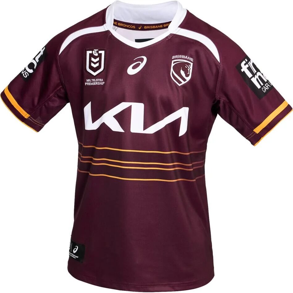
The Jerseys Tell Their Own Story
Some fans underestimate how much a jersey communicates. In 2026:
- The home kit strips away busy patterns, allowing the shield to hold centre frame.
- The Cyril Connell away jersey taps into Queensland rugby league heritage at a moment when history is becoming a competitive advantage.
- The trims and stitching act as subtle reminders that Brisbane isn’t abandoning its roots — just reshaping them.
And Then There’s “We Charge On”
The mantra works because it does two jobs:
- Internally, it reminds the players that premierships don’t protect you from decline.
- Externally, it frames the rebrand as purposeful rather than aesthetic.
In other words: this is not a makeover — it’s a message.
How Fans Are Interpreting the Change & Why Their Reactions Matter
Fans are rarely shy when a club touches its history. And the responses to this rebrand follow a familiar pattern seen across sports.
Who Welcomes the Change:
- Younger fans drawn to clean, modern visuals
- Supporters who see global ambition as essential
- People who value consistency across digital platforms
Who Pushes Back:
- Traditionalists who feel the horse should stay side-profile
- Former players like Corey Parker and public figures like Ian Healy who favour legacy
- Fans who believe modern minimalism sometimes strips away personality
Both sides have valid points. The editorial truth sits somewhere in the middle: tradition matters, but sports brands can’t freeze themselves in time. If the Broncos want to remain Queensland’s flagship club — especially with Dolphins momentum rising — they can’t rely on nostalgia alone.
The reported $300,000 cost also stoked debate, but branding experts often argue that the real value lies in how well the new identity performs over the next decade, not how much it cost today.
Conclusion: A Club Preparing for the Future Whether Fans Agree or Not-New Broncos logo meaning
The Broncos’ 2026 rebrand isn’t perfect — no major redesign ever is. But it is intentional, strategic and aligned with where Brisbane as a city is heading. The simplified crest, streamlined jerseys and “We Charge On” mantra form a unified identity built for broadcast clarity, international reach and cultural positioning.
And as opinions continue to swing between admiration and frustration, the New Broncos logo meaning remains the same: a symbol of a club choosing to evolve now, rather than being forced to later.


